Speedy Incorp
A responsive web design project that helps a UK-based incorporation agency to build trust & turn prospects into buying customers.

OVERVIEW
Having serviced hundreds of clients in the incorporation business for over 8 years, Jay Wang, Speedy Incorp’s founder, decided to embark on a venture that helps global businesses to start and operate offshore companies.
In an industry where trust comes first, Speedy Incorp needs a prominent digital presence, as well as a clear exhibition of its services & offerings that timely deliver what their clients need.
MY ROLE & DURATION
Web Designer
Responsive web design on Wordpress & Elementor
Nov - Dec 2024 (4 weeks)
Project Outcomes
Monthly leads increased by 54%.
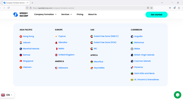

A digital agent that provides incorporation services in over 23 jurisdictions.
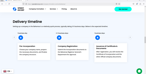
A clear user journey on all relevant services and offerings.

My Key Contributions
Organize content in a sequence that helps explain the business
Optimize system communication with users & agency
Enhance accessibility through responsive web design
Strengthen Speedy Incorp’s identity by consistent use of graphical elements
Strategic Flow of Content
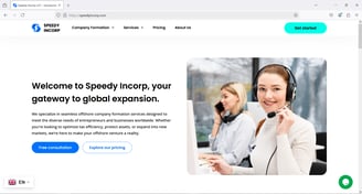
Understanding that Speedy Incorp wants their customers to view them as transparent and up-front, I have advised the company to present themselves in a deductive, top-down manner.
Homepage starts with a hero section, which briefly addresses the company as an industry specialist, and closes with 2 high-level call to actions (CTAs). This serves as an invite to more conversations about products & services.


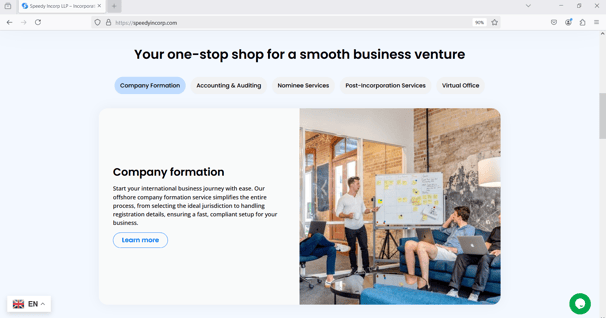
User is then guided through a catalogue of incorporation services, with each one containing a CTA that leads to the respective service.
As long as user is interested in offshoring their business, there is always something for them to look out for in this section.


This section lays out key missions during 3 main stages of an offshore business, which helps users understand better how partnering with Speedy Incorp helps elevate their companies.
2 CTAs are embedded at the end of this part to further accommodate users. For those who have more questions, they can book a free consultation. For those kind of already know what they want, they might as well check out the prices.
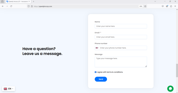
Homepage closes with a contact form, which is this page's last effort to generate leads and spark the first conversation with users.
This also invites users to ask more questions, if any.
Optimizing User-Agency Communication
The website serves as a prudent digital agent that assists users on every incorporation matter, on behalf of Speedy Incorp. Therefore, I was tasked with enhancing user-agency communication stays smooth & free from silos.
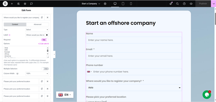
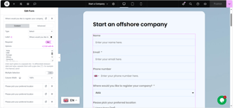
Dynamic Contact Form
Contact forms are the main lead generating tool on this website. Depending on each service, Speedy Incorp needs specific client inputs.
Some forms involve conditional logics that help customize & specify user needs.

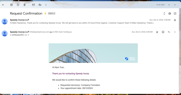
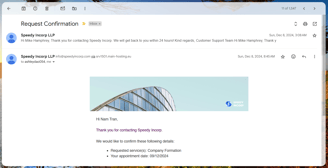
Timely, Branded, and Informative Confirmation Emails
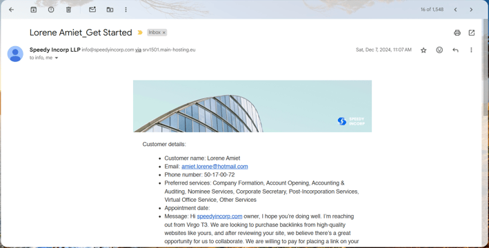
For every user request, the system sends out 2 confirmation emails.
One email is to confirm with users that their inquiry is under review.
Another mail will arrive in Speedy Incorp's mailbox, which tracks & reports all the important inputs.

Multi-Language Support
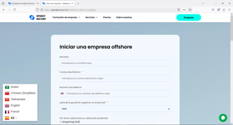
As Speedy Incorp services global clients, I have embedded Google Translate plugin on the website to accommodate certain strategic regions where people do not speak English.
Responsive Web Design
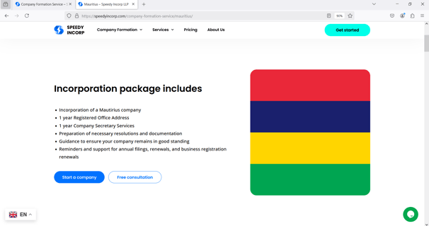
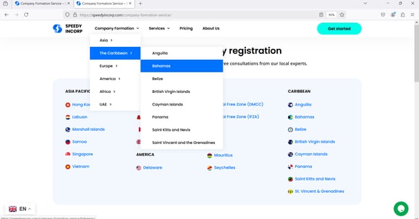
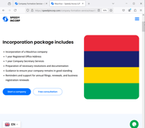
Besides accommodating users on multiple devices, I was also tasked with breaking down certain components & making them more understandable in smaller sized screens.
Content-Decluttering Components
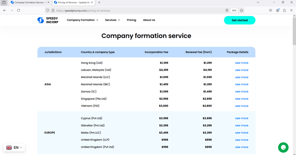
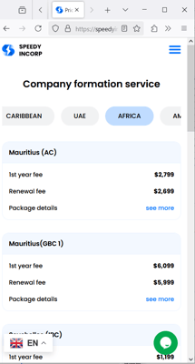
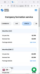
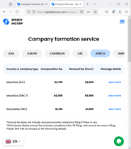
Components with more complexity like the price table need to be easily understood on smaller screens.
Realizing that using a filter helps declutter the mega price table into regions, I have incorporated it into the website.
Now users can easily move between region tabs to view & compare prices of the same service.


Text Hierarchy & Layout Change
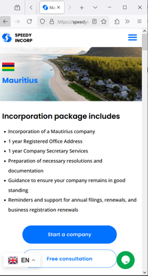
Text is organized in a hierarchy, with each one following a 2pt-8pt increment as screen size grows from mobile, to tablet, and desktop.
Layout of most page sections also change from multi columns to one column as horizontal space changes.
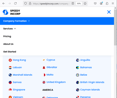
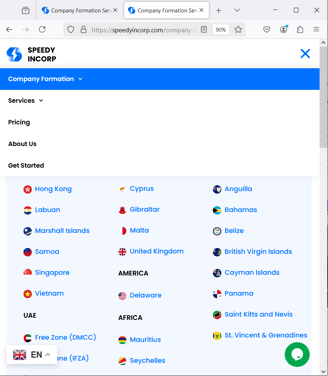
Dynamic Top Menu
Desktop view maximizes horizontal space with the wide menu bar. This helps users to seamlessly browse various categories.
Menu bar also hides on scroll-down & reappears on scroll-up, which gives vertical space more flexibility & makes scanning more immersive.
Tablet & mobile view wraps menu in a burger format, which collapses & folds on click. This menu is sticky due to no issues with vertical space.
The Final Design
The website has helped the agency generate 54% more leads than the previous month, which is mainly the function of the website at this stage of the company.
Please interact with the iframe below to experience the website.
My Key Takeaways
It helps to add a week of buffering time.
During the project, my client requested some extra features that were not part of the approved proposal. I had to also postpone 2-3 alignment calls due to schedule conflicts. I ended up delivering the projects 1-2 weeks later.
Showing previous works helps me claim expertise and reduce micro management.
My client regularly want to check project progress, which causes me some unnecessary anxiety. I tried to prevent this from happening by facilitating brainstorming sessions & clarifying expectations from both sides. During these meetings, I also show them how I worked with my previous clients. This has helped them clearly imagine the end-to-end design process, which made them trust me more.

